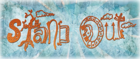
Ever go to a job fair, chamber of commerce, bulletin board, or coffee shop flier stand? What do you see there? I typically see is an ocean of cookie-cutter marketing materials strewn about, hoping to catch the attention of a potential client. Unfortunately many of these businesses, events, or people hoping to catch a break are only contributing to the mess. They spend countless hours, and hundreds, (if not thousands of dollars), hiring a designer to create a look and a printer to deliver that message so they stand out from the crowd. Yet, when using the same ol’ fonts, colors, and layouts, how unique can one be? That’s where hand-drawn elements can make your dollars (and time) count.

Illustrations, either hand-drawn or painted, can make your business, event or project really POP! They can add that personal flavor that visually represents the person behind the project. And surprisingly enough, it doesn’t have to cost an arm and a leg to do so. If you don’t have the budget to recreate an entire website or full identity, you can often spice things up with just a few hand-drawn flourishes, icons, or hand-painted textures, etc.
Illustrated design may not be for every business or everybody. For instance, if you are in financial consulting and appeal to a more conservative, middle-aged crowd, then a streamlined, corporate look will most likely be best. However, if you are hosting an event or creating a fundraiser t-shirt for a Gen X/Gen Y crowd who loves the outdoors, pets, music or art, then a hand-drawn theme may be the exact way to catch the attention of your market.
In a world of over-stimulation and constant eye-candy, it seems impossible to make your materials stand out from others. However, offering the alternative from the standard will most likely gets heads turning, and eventually clients and customers coming your way.
